Year
2021
Client
Hotel dP
Projects
Corporate identity
Online
hotel-dp.it/


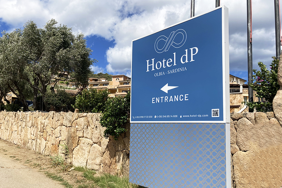
The logo is a graphic representation that characterizes the naming of the hotel: the two letters, written in lowercase and capital letters, are placed side by side so as to remember the symbol of infinity, as a symbolic reference to the multilateral services that the Hotel dP Olbia - Sardinia can offer the customer. Simultaneously, the brand is also configured as a reminder of the geographical position of the hotel, overlooking the Gulf of Olbia, recalling a seafaring knot. The color also aids in the identity of the logo.


